
A customer who lands on your product page has already passed the hardest filter: they found your store, they were interested enough to click, and they are looking at the thing you sell. The purchase decision they make in the next 60 seconds is not primarily a question of whether they want the product. It is a question of whether they trust you enough to hand over their payment details. That question is answered, or not, by the trust signals your product page does or does not contain. This article covers the specific trust signals that are measurably moving conversion rates on Shopify product pages in 2026, where to place them, the data behind each one, and what most stores are getting wrong.
Why Trust Is the Conversion Variable Most Merchants Underestimate
Most CRO attention focuses on traffic, pricing, and checkout friction. Trust is treated as a secondary concern, something handled by having a professional-looking store. The data does not support that framing.
Baymard Institute's 2026 checkout research identifies trust concerns as a top-five driver of checkout abandonment, with 19% of US shoppers having abandoned a purchase in the past three months specifically due to security concerns about payment information (Statista, 2025). That is not a fringe concern affecting a small minority. It is nearly one in five potential customers leaving at the final stage because the trust foundation was insufficient.
On product pages specifically, the problem is upstream. A customer who does not trust a product page never reaches checkout. Shopify's product page optimisation guide notes that 72% of consumers will not take any purchasing action until they have read reviews. Research aggregated by Sitetuners puts the conversion rate lift from displaying customer reviews at up to 270% when five or more reviews are present. That is not a marginal improvement from a single element. It is one of the largest single-element conversion levers available on a Shopify product page.
Building trust on a product page is not one decision. It is a stack of specific, independently measurable elements, each addressing a different category of buyer hesitation. The merchants converting at 4% and above have all of them in place. The ones converting at 1.4% are typically missing several.
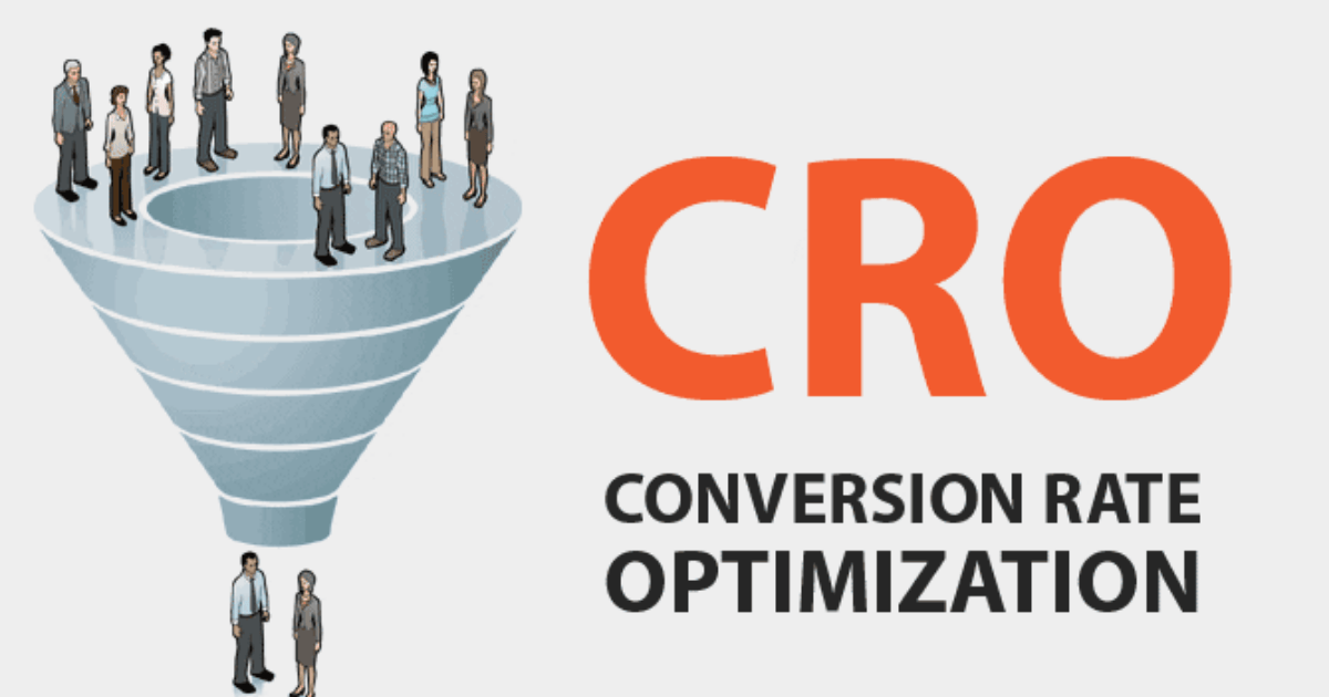
Trust Signal 1: Reviews, Placement and Volume Are Both Variables
The existence of reviews on a product page is table stakes. Where they appear and how many exist are the variables that separate stores converting at 2% from stores converting at 4%.
The volume data is unambiguous. PowerReviews research shows products with 11 to 30 reviews convert approximately 68% higher than products with zero reviews. The sweet spot for maximum conversion impact is 26 to 50 reviews, balancing volume as a credibility signal with authenticity, a product with thousands of reviews on a small store triggers suspicion rather than confidence. Spiegel Research Center data puts the probability of purchase for a product with five reviews at 270% higher than the same product with no reviews. A single review improves conversion rates by 10% or more (Fera, 2025).
The AOV effect is significant. For high-priced products specifically, adding reviews increases conversion by up to 380%, compared to 190% for lower-priced products (Fera, 2025). The higher the price, the more the customer needs social validation before committing. A $200 product page without reviews is asking for a commitment that the customer has no peer evidence to support.
Placement determines whether reviews convert. Reviews buried at the bottom of a product page after 1,500 words of description are not performing the trust function they are capable of. The star rating aggregate, the average score and review count, should appear directly below the product title, visible above the fold on both desktop and mobile. Shopify's own product page guidance cites LNDR as an example of prominent star rating display that works: the average user rating appears at the top of the page where every visitor sees it before scrolling.
Recency matters as much as volume. Research from Popupsmart shows 83% of customers believe reviews older than three months are unreliable. A product with 200 reviews, all from 2023, is less persuasive than a product with 30 reviews from the last 90 days. The review request sequence in your post-purchase email flow, timed 7 days after confirmed delivery, is what determines whether your review supply stays current. A store that stopped collecting reviews six months ago is losing conversion on every product page without knowing it.
Negative reviews belong on the page. Counter-intuitively, 95% of customers suspect fake or censored reviews if there are no negative ones (Fera, 2025). A product with a 4.6 average and some critical reviews is more persuasive than a product with a perfect 5.0 rating and nothing but praise. Negative reviews that merchants respond to publicly demonstrate customer service quality. Leaving one-star reviews live, with a professional response, builds more trust than deleting them.
Trust Signal 2: Photo and Video Reviews, UGC Over Brand Content
Text reviews are trusted. Photo and video reviews from real customers are trusted more, and they convert better.
62% of consumers are more likely to make a purchase when they can see photos and videos from other customers (Trustmary, 2025). 72% of consumers trust customer-submitted photos and reviews more than stock photography or brand-produced images (WiserNotify, 2026). The reason is straightforward: brand photography is designed to make the product look its best under ideal conditions. A customer photo shows the product as it actually arrived, in an actual home, on an actual person. The gap between what the brand shows and what the customer receives is the source of most post-purchase disappointment, and customers know this, which is why they actively seek out real customer images before buying.
Video reviews convert at even higher rates. Trustmary's data shows replacing text reviews with video testimonials can increase conversion by 80%. 79% of consumers have watched a video testimonial to learn more about a product or service, and 77% of those viewers say it played a part in convincing them to buy. Video resolves every question that static images cannot: how the product moves, sounds, feels, and functions in real use.
For Shopify merchants, the mechanism for collecting photo and video reviews is the post-purchase email sequence. Apps including Okendo, Yotpo, and Loox all prompt customers to upload photos and videos with their review submission. The submission rate for photo reviews is significantly higher when the request email includes a specific prompt, "show us how you're using it", rather than a generic review request. The customers who have strong opinions about a product are the most likely to photograph it. The job is to make the submission mechanism easy and the prompt specific.
Trust Signal 3: Trust Badges, Type, Placement, and Relevance
Trust badges are the category of trust signal with the widest range of quality. A well-placed, relevant badge at the right moment reduces purchase hesitation measurably. A poorly chosen badge placed out of context adds visual clutter without addressing any real concern.
Shopify's trust badge guide identifies five badge categories with distinct purposes:
Security badges (SSL, secure checkout, encrypted payment) address the specific fear that payment information will be compromised. This is the category most directly linked to checkout abandonment, 19% of US shoppers have abandoned due to payment security concerns (Statista, 2025). Security badges belong on the product page near the Add to Cart button and repeated on the checkout page. They should be recognisable and specific: "256-bit SSL Encrypted" is more persuasive than a generic padlock icon because it answers the specific question the customer is asking.
Payment method badges (Visa, Mastercard, PayPal, Shop Pay, Apple Pay, Afterpay) signal legitimacy and accessibility. A customer who sees their preferred payment method displayed near the checkout CTA has one less reason to hesitate. Yotpo's 2026 CRO guide identifies payment icon display as a "small but powerful trust signal" that reassures shoppers they are dealing with a legitimate business. ShopClimb's trust badge app automatically displays location-relevant payment logos, showing Klarna for German visitors and iDEAL for Dutch visitors, which increases international conversion rates by addressing each market's specific payment preferences.
Policy badges (free shipping, free returns, money-back guarantee) address risk rather than security. The National Retail Federation research shows 82% of customers say free returns are important to their purchasing decision (Shopify, 2026). A money-back guarantee displayed on the product page near the CTA removes the commitment risk that causes hesitation on first purchases. The guarantee does not need to be exceptional, a standard 30-day return policy displayed clearly converts better than a generous policy that is hidden in the footer.
Endorsement and certification badges work specifically for categories where third-party validation matters: skincare with dermatologist testing, supplements with NSF certification, organic products with USDA certification, sustainable products with B-Corp status. Tower 28, a skincare brand, displays their National Eczema Association seal of acceptance on product pages. Founder Amy Liu describes endorsement badges as "a reason to believe" that has measurable persuasive value with the target customer (Shopify, 2026). Category-specific certifications on category-specific products outperform generic security badges because they address the specific credibility question relevant to the purchase.
Placement principle for all badges: Trust badges earn their conversion value at the moment of decision, near the Add to Cart or Buy Now button. Badges in the footer or on a standalone trust page are decorative. Badges immediately adjacent to the purchase CTA are functional.
Trust Signal 4: Shipping and Delivery Clarity Before Checkout
The absence of shipping information on a product page is a trust failure that most merchants do not recognise as such. When a customer cannot determine when their order will arrive or what shipping will cost, their default assumption is pessimistic: slow and expensive.
Baymard's 2026 checkout research identifies unexpected costs at checkout as driving 48% of cart abandonments, the largest single abandonment category. A significant portion of this abandonment is not surprise at the cost itself but at the existence of a cost the customer had not accounted for when deciding to purchase. Showing shipping cost on the product page, even if it is not free, eliminates the mismatch between the customer's price expectation and the checkout total.
Specific delivery dates convert better than ranges. CRO Digital Marketing's 2026 research identifies delivery timeline uncertainty as a significant conversion blocker. "Ships in 3 to 5 business days" creates mental uncertainty. "Order today, arrives Tuesday April 7" anchors the commitment to a specific, plannable date. Shopify's order delivery date features and third-party apps that calculate and display estimated delivery dates on product pages address this directly.
Returns policy visibility. A clearly linked returns policy on the product page, written in plain language and accessible with one click, reduces the risk perception that holds back first-time purchasers. GetMesa's conversion guide notes that a generous, clearly stated return policy increases conversions because it reduces perceived risk, the customer knows they can correct the decision if it turns out to be wrong. The policy itself matters less than its visibility and clarity. A standard 30-day return policy that is easy to find converts better than a 60-day policy that is buried.
Trust Signal 5: Contact Information and Brand Transparency
Hidden or hard-to-find contact information is a trust failure that directly signals the merchant is not willing to stand behind their products. A customer who wants to know who they are buying from and cannot find a phone number, email address, or physical address has an unanswered question that the purchase decision requires answering.
This trust signal is not about having a complex support infrastructure. It is about visibility. A live chat widget, a clearly displayed support email, a phone number in the header, or a visible link to a Contact page from the product page all tell the customer that a real business with real accountability is on the other side of the transaction. The absence of any of these signals tells the customer the opposite.
Shopify's conversion guide specifically calls out recognisable contact options as a trust signal that appears where decisions happen. Shopify Inbox, which enables live chat directly from the store, addresses this for merchants who want synchronous contact options without building a full support infrastructure. Research from Superoffice shows adding live chat to an ecommerce website can increase conversion rates by 40% (Ringly.io, 2026), a significant lift from what is functionally a contact and trust mechanism.
Trust Signal 6: The About Us Page as a Conversion Lever
The About Us page is the most underused trust asset in most Shopify stores. Customers who navigate to an About Us page before purchasing are typically in the final stages of deciding whether the brand deserves their trust, they are not browsing, they are vetting.
46% of consumers trust online reviews as much as recommendations from a friend (Shopify, 2025). The human behind a brand story, a founder, a team, a specific reason the product was built, provides a different category of trust than product reviews. It answers the question: is this a real business with real people who care about what they make?
An About Us page that connects back to product pages through internal links, or that surfaces the founder story in a banner or section on the product page itself, extends this trust layer to the purchase decision moment. Several high-converting Shopify stores include a brief founder note, one or two sentences about why the product was made, directly on the product page. This costs nothing to implement and addresses the legitimacy question that trust badges cannot.
Trust Signal 7: Above-the-Fold Completeness on Mobile
All of the trust signals above deliver their maximum value only if they are visible at the purchase decision moment. On mobile, which accounts for 79% of Shopify store traffic (Uptek, 2026), the above-the-fold area is smaller than on desktop, and most product pages are not optimised for what is visible before the customer scrolls.
SplitDev's 2026 UX analysis is explicit about the requirement: above the fold on mobile, customers need to see the product name, price, a clear Add to Cart CTA, and at least one trust signal, without scrolling. The most common failure mode is a product page where the review star rating, the security badge, and the return policy are all below the fold on mobile because the hero image is too large and the product description is too long.
The practical audit: open your product page on a mobile device and note what is visible without scrolling. If the Add to Cart button and at least one trust signal, a review star rating, a security badge, or a policy callout, are not in that visible area, the page is losing conversion from the largest traffic segment on mobile before those elements even have a chance to perform their function.
Adding product reviews to a product page alone can increase conversions by 10 to 15% (SplitDev, 2026). That improvement is measured when the reviews are visible and functional. A store that has reviews below the fold on mobile is receiving a fraction of that lift.
The Trust Audit: What to Check First
For merchants who want to apply these trust signals systematically, the fastest audit is a five-minute review of your highest-traffic product page on mobile:
Is a star rating visible above the fold? If not, move it directly below the product title.
Are there at least 5 reviews, with at least one in the last 30 days? If not, your post-purchase email sequence needs a review request. This is the fastest path to the single largest conversion lever on your product pages.
Is there a security or payment badge near the Add to Cart button? If not, add one. Shopify's theme editor allows badge placement in the product form section without developer work.
Is your return policy linked or stated on the page? If it is only in the footer, add a one-line policy callout near the CTA: "Free returns within 30 days."
Is shipping cost or an estimated delivery date visible? If not, add a shipping calculator to the product page or display a flat shipping rate.
Is your contact method visible from the product page? If not, add live chat or a visible email link.
None of these changes require a developer. All of them address a category of buyer hesitation that is costing you measurable revenue from traffic you are already paying to acquire.